10.7. Specific tabs for particular type of controls
10.7.1. The Specific tab for Line edit control
 -
Line edit control allows you to edit a text of a single line.
Echo field of Specific tab lets you set if during a text
edition the characters be able to write (Normal) or not (No Echo) and whether
asterisks be able to display instead of a text (Password). The tab helps you
to set a maximum value of characters (Maximum character count) that can be
written by a user. You can also choose if Line edit is surrounded with a
frame (Frame around this single line edit).
10.7.2. The Specific tab for Label control
 -
Label control displays one or more rows of a text or a picture.
Specific tab allows you to pass a path to a graphic file or use a preview
button to choose the file using a dialog. If a graphic file can be displayed,
it will replace a text of a control. If a text is displayed, you will set a
kind of paragraph and whether a text be able to split into lines including
whole words. You can do this using buttons from Alignment group.
Transparent control option lets the control be transparent. In a case when a text is
displayed, a background of the control won't be shown while in a case when
a picture is presented, the control only will exist in points that the
picture isn't transparent.
10.7.3. The Specific tab for Push button control
 -
Push button control confirms a user's choice.
The tab lets you pass a path to a graphic file like in a case of
Label. It allows you to choose
whether the control can be a default button for a dialog or it can
be Toggle button. In this case you must pass equivalent of some
integer number for each of states.
10.7.4. The Specific tab for Progress bar control
 -
Progress bar control mostly shows current value (greater or equal zero)
of a specified parameter.
Orientation group of Specific tab gives you two ways of
Progress bar presenting: Vertical or Horizontal. The control
must have a maximum positive value (a minimum one is always
equal zero). The value can be passed as fixed or it can
depend on an object value of monitoring device when its
identifier (OID) is passed. When you want to build this
identifier through sticking some string, you can choose
additionally Accept ID string sticking field. In Text group
you can pass one of three possibilities of a current value
displaying: without a text, an absolute value or a percent value.
10.7.5. The Specific tab for Check box control
 -
Check box control is a toggle button and allows you to
select or unselect a specified option.
Check box is a control similar to
Push button. So, Specific
tab lets you pass a graphic file which is displayed instead of a
text. Because the control has two states, you must pass some
integer numbers for each of states.
10.7.6. The Specific tab for Combo box control
 -
Combo box control allows you to choose a specified
item of available items list.
Style field of Specific tab allows you to choose one of
three accessible styles. Motif 2 (read-write) style lets you edit Combo box
control. In this case you can choose automatic adding of a completion from
an available items list (Auto completion field). You must also pass how
many lines a field of a control list will be high (Line limit field)
and you must assign a number to the first line in Read-Write mapping
group. This assignment allows to imitate values on a text from an
available items list (this object sends by Write action and receives
by Read action an integer value unless the list is created dynamically).
The edited field allows you to pass specified items of the list. If the
list of items is created dynamically, you must choose Dynamic list field.
Then Combo box ID string allows you to build items of the list. The object
identified by the ID string means as the first item of MIB chart, that will
be transformed into an item list of the control through the next SNMP
requests of Get-Next type.
10.7.7. The Specific tab for Group box control
 -
Group box control groups objects.
Specific tab allows you to choose a kind of a
title alignment as regards an object width. A text can be aligned
to left or right side or central.
10.7.8. The Specific tab for List box control
 -
List box control lets you set an item of a list.
In Read-Write mapping group of Specific tab
you should pass an index value of the first item to which a
control value will be mapped during its recording or reading (similarly as in
Combo box control). A static item
list you can pass in Items dialog. If you want to create a dynamic list,
you should choose Dynamic list. A creation procedure and working of the
list was shown describing Combo box control.
10.7.9. The Specific tab for Radio button group control
 -
Radio button group control lets you choose one of
options available in a group.
Text alignment field of Specific
tab lets you set a specified kind of a title alignment. You can
also create a list with accessible options passing names of
objects in Radio buttons group and you can set an order of
their indexing and ascribe an initial index number to the
first object (Start indexing from field). A defined Radio
buttons you can configure by duble clicking it the left
mouse button. Then you can pass a path to a graphic file
that is displayed instead of a text. Each object like that
you can move and change its size but only within Radio button group control.
10.7.10. The Specific tab for Scroll bar control
 -
Scroll bar control lets you manipulate other control value
and present a current value between defined ranges.
In Range group of Specific
tab you can pass limited values (a minimum and maximum value). In Steps group
you should set quantity of steps and in Orientation field - a kind of the
control orientation. There are a list of objects connecting with the control
and buttons to manipulate the list items in Connected controls group.
These objects will react to moves of the control slide.
Objects receiving new values of Scroll bar update their
view depending on their specific properties.
As in case of Progress bar
you can set that limited values will be able to change dynamically (in case of
Progress bar you have one limited
value while the second value is always zero). A description of Sroll bar and
its list of items created dynamically is described in
Progress bar description.
10.7.11. The Specific tab for Slider control
 -
Slider control lets you manipulate values of other
control and present a current value between defined ranges.
Specific tab includes configuration items similarly to
Scroll bar. In Ticks
field you can choose a way of drawing of a scale marks around the control while in
Interval group you can set a distance between marks of a scale.
10.7.12. The Specific tab for Spin box control
 -
Spin box control allows you to manipulate
a value taking specified ranges into consideration.
In Range group of Specific
tab you should pass a range of values accepted by the control (as in
Scroll bar
and Slider). In Steps group
you should pass a step quantity of the control. Choosing Wrapping
option causes the values are wrapped i.e. after the greatest value
follows the lowest one and vice versa. In Text group you can pass
Prefix and Suffix appearing around displaying value
of Spin box. A minimum value can be displayed as a text if you pass it in
Text when min. field.
10.7.13. The Specific tab for List view control
 -
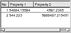
List view control presents a list of items split into columns.
If you choose Dynamic lists field of Specific
tab, you will be able to create a list of items dynamically for an object,
otherwise you must pass in Rows count group,
in Static value field a number of rows.
When you press the button
 , Cells configuration dialog appears.
It allows you to configure particular cells of a list showing different
possibilities. They are depended on the list which is static or dynamic.
For the static list, all cells (number of columns multiplied by number
of rows) are available while for the dynamic one - only the first row.
When you choose a column of Current column field and double click the
left mouse button on the specified row of the list, A single cell
configuration dialog appears for a specified cell.
For each cell you can pass an object identifier of MIB that the
cell presented a value of the object. In this case you should set
Accept incoming Pdu field. If the identifier is built by sticking
additional OID, you must choose Accept ID string sticking
option.
In Columns group of Specific tab is presented a list
of columns.
When you define a new column and press the button
 , New column dialog appears in which you should pass its title,
its initial width and its kind of a text alignment and you must
decide, that a column will react to clicking the mouse or you
will be able to change its width.
All columns show focus field of Specific
tab allows you to choose that all columns will have a focus or only the first one.
Enable column moving field shows you if the columns can be replaced.
The button
 runs Configure sorting
window that allows you to configure a sorting for a whole object:
a column number and a kind of an order (increasing or decreasing).
10.7.14. The Specific tab for LCD number control
 -
LCD number presents a numerical value.
Number of digit field of Specific tab allows
you to set a number of digits that will be displayed. Degree style option
shows you if a degree character is displayed or not. In Mode group you
can choose one of four ways of number displaying: binary, octal, decimal,
hexadecimal. If Degree style option is set, decimal number always will be
displayed. Segment style group lets you choose one of three ways of digit drawing.
10.7.15. The Specific tab for Graph control
 -
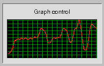
Graph control presents next values of data in a form
of a time function graph.
In Range group of Specific tab you should
pass limited values (a minimum and maximum value). In Title alignment and
lines count you can choose a kind of a text alignment, a number of
horizontal lines and distance between them. Filled graph option lets
you choose that a graph will be filled with color or drawn as line.
Show increase of the value instead of its own option helps you to
show an increase of the value instead of the value. In Colors group
you can choose colors that will be used to draw a graph, a grid and a background.
As in a case of Progress bar
you can set that limited values were depended on values of MIB objects.
The Graph work is shown in a description of
Progress bar control.
You can also use other way to manipulate the control ranges choosing
Use dynamic ranges option. It shows that limited values can
be changed when are exceeded during the control work.
10.7.16. The Specific tab for Control light control
 -
Control light control shows its current state
in an intuitive way.
In All values group of Specific
tab you can pass a number of all possible values. For each value
in Current item group, fields:
Min value and Max value assign a
closed range of accepted values by the item. Type field allows
you to choose a kind of a shape or a graphic file that will
represent this value. Depending on specified value of Type field you
can pass a path to a graphic file or a line color and a color
filling a specified shape and whether the shape can be drawn
flatly or spatial. Flashing timer interval in 1/10 of second
0 means inactive) field lets you turn on timer with a given
interval in 1/10 of seconds. A zero value causes the timer
isn't run. During the work of a timer Control light
alternately accepts once a given value (a value, that
is currently configured) and next time a value given
in Assign this value when in inactive state (when flashing) field.
Chooseing Transparent control option causes that the control
will be without a background (it will be transparent).
10.7.17. The Specific tab for Line control
 -
Line control shows its current state in an intuitive way.
A configuration of Line
control is similar to Control light
configuration. A main difference is a fact that a value of Type field
is common for all the control values. In Line width filed you should
pass a control width in pixels. Line control as distinct from
Control light always is transparent.


