14.6. Configuration of controls common properties
You can build a panel using controls which there are on the left side
of the main view of the application. You should press only a selected control
and click with the left mouse button above the area of the panel. When you
draw a rectangle area instead of clicking the mouse, a control fills this
rectangle area itself. You can use the controls as follows:
The first button isn't a button of a control but it allows you to unselect a
pressing button of a given object.
If you press the button
 ,
and choose any control or double click above the area of a control with the
left mouse button, you can configure a choosing object. For all controls
a window with 3, 4 or 5 tabs is appears. Main, Style
and Specific tabs
appear for each controls. Actions tab almost always shows while Frame
tab shows only in same cases. A list of displaying tabs for particular
controls is shown below in the table
in the next part of the document.
,
and choose any control or double click above the area of a control with the
left mouse button, you can configure a choosing object. For all controls
a window with 3, 4 or 5 tabs is appears. Main, Style
and Specific tabs
appear for each controls. Actions tab almost always shows while Frame
tab shows only in same cases. A list of displaying tabs for particular
controls is shown below in the table
in the next part of the document.
Main, Style, Actions and Frame
tabs look similarly for all controls (an exception is Main tab and remotely Actions
tab) while Specific tab is different for each of controls.
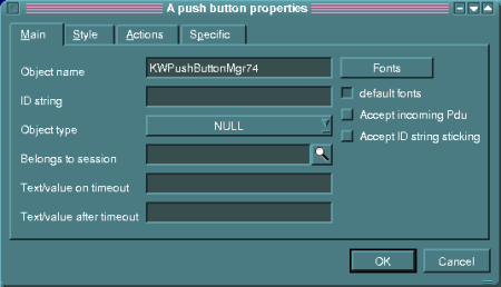
In Main tab is placed Object name field, that lets you specify an object name.
An object with the name will be available for other controls and the panel. You can
set also a kind of a font (Fonts button) different from default one. If an object
is connected with SNMP i.e. if it is used as an argument of Read action or Write
action, you can pass its ID string. If an object is used to set a value of SNMP
(Write action), you must set a type of this variable by choosing an option of Object
type field. You should set Accept incoming Pdu to update an appearance of the object
basis of working results of Read actions. Sometimes you can want to paste
an additional OID to ID string. Then you must set Accept ID string sticking
in object properties. You should pass also a session name in
Belongs to session to use an object in any action Read or Write type.
In Text/value on timeout field you can pass a value that a control will
receive when it doesn't receive a response from a polling device in expected time.
This value will be interpreted as a text when a control (i.e. Label) expects these
values otherwise the value will be interpreted as a numerical value.
In Text/value after timeout field you can pass a
value that a control will be received after timeout when it doesn't
receive a response from a polling device.
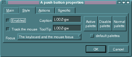
Style tab includes a field of choice that gets you four possibilities
of receiving of Focus for a given controls: a lack of focus, focus by pressing Tab key,
focus by pressing the mouse button and two last options together. In Caption dialog you
can pass an inscription which is displayed on a given control (it concerns a part of
objects). In ToolTip dialog you can pass a text which is displayed in an response
dialog above the object when you drag the mouse cursor on it (empty inscription
means a lack of a response). Turning on Enabled option allows you to set a given
control in an accessible state by the mouse or the keyboard.
Three buttons are placed on the tab and they helps you to set free color for any controls.
Each of the buttons let you specify color which is characteristic for a state in which any
controls can be (active, passive and normal).
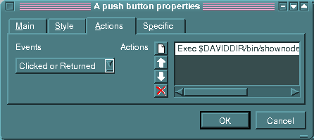
In Actions tab for each event you can specify a list of actions
that will be done. Events for controls mostly can be in two kinds: pressing the
left mouse button while the Enter key stays pressed and double clicking the left
mouse button. The second event in the case of the mouse always must be preceded
the first one. It can cause a situation that actions joined to a double clicking
cannot occur or they quickly occur after actions for a single clicking. For this
reason you shouldn't define actions for this both events in the case of the same
object.
A user has five different kinds of actions at his disposal. Only some type
of objects have all kinds of actions. Close action allows you to finish a work
of the panel. If the panel is like a dialog, it only closes itself. If it is
like a main panel, a work of the whole application is finished. Read action
lets you read data of specified objects to update their current view on the
panel. Write action passes this data to a managed device.
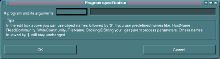
Program specification Program specification window
defines Exec action and it allows you to specify the program and its
parameters that will be run during a given event is done. When you
specify a program and its parameters, you can pass names preceded $
sign. A name can be: an environmental variable that will be defined
during the panel is working, a control name which a value we want
to use, a keyword as HostName, ReadCommunity, WriteCommunity,
FileName, StickingIDString including appopriate input parameters of
xdnnv.
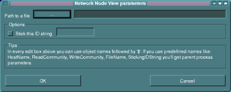
Network Node View parameters window
defines Dialog action and it allows you to pass names of a configuration
file for xdnnv describing the main panel.
You can choose Stick this ID string
option and pass OID that will be pasted to controls of a given panel. As in
case of Exec action, you can use $ sign and pass after it names of controls
or keywords (you can't use environmental variables). Dialog action runs a
service of a specified panel in a modal dialog in contrast to Exec action
which runs some program.
The buttons of Actions tab allows you to manipulate a list of actions for a given event.
The button
 lets you define a new action among described above.
You can specify Read and Write actions in the same way like the
panel configuration.
lets you define a new action among described above.
You can specify Read and Write actions in the same way like the
panel configuration.
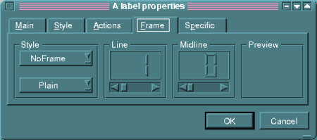
Frame tab lets you configure a frame style of an object
and its line width that a frame will be built. In Style
group you have some possibilities at your disposal: No Frame, Box,
Panel, WinPanel, HLine,
VLine, Styled Panel,
PopupPanel and frame styles as: Plain,
Raised and Sunken. In Line
group you can define an outside line width of a frame and in Midline
group - a middle line width. An effect of current settings is shown on the preview.
14.6.5. Tabs for particular controls